Week 2:
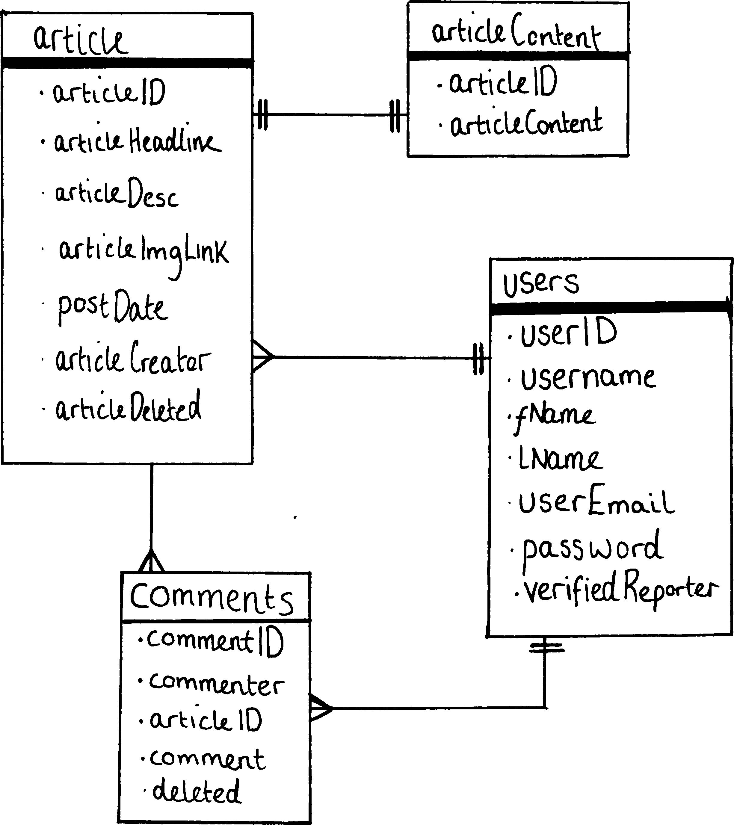
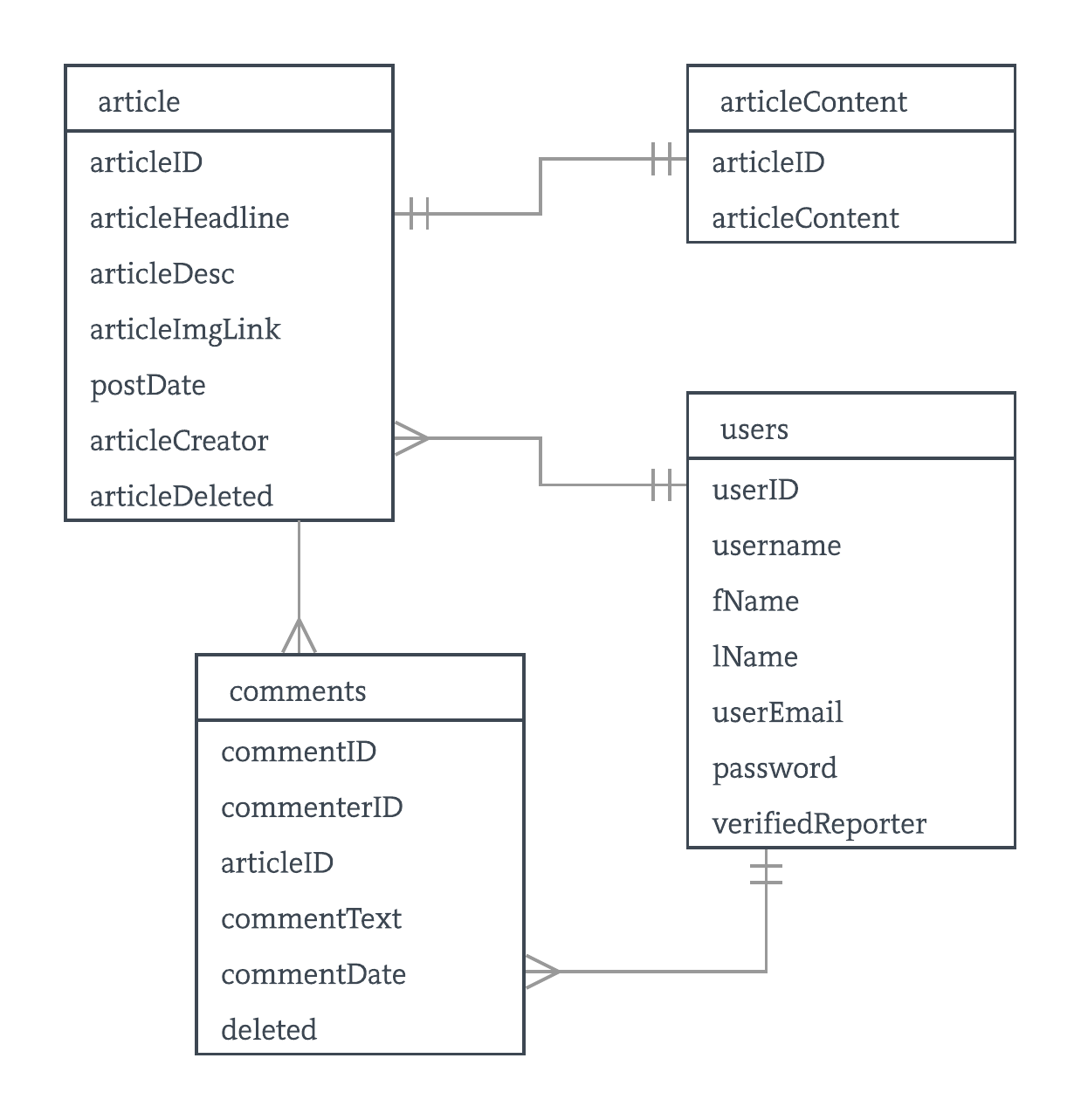
Database design is an essential part of the development process of a website or web app, it is important that you take into consideration as many possible directions in which you think your development might take you. A well designed database will provide you with quick access to the data you need, because if the importance of this, it is essential that you invest time into a design which follows the basic principles of good database. In the hand-drawn design seen below, the separation of data into four tables can be seen, each holding different sets of data; article info, user info, comment data, and article content. Interestingly The decision to hold article content separate from the article data was made, this was for a few reasons, one of them being that it was known that there would be queries to the article table frequently and not actually using the large article content resulting in large amounts of data being queried unnecessarily. By separating this, queries should in theory run faster, improving the website’s usability. Additionally, in the users table, there is a column named “verifiedReporter” which is used to store a boolean value of whether or not a user is able to access the article posting system. Furthermore, one may take note of the existence of the “deleted” columns in the article and comments table. By doing this it is posislbe to determine if the article or comment is displayed without deleting it from the database. Flagging or marking as deleted is a very common practice in database systems, almost all major companies will use this form of deletion as opposed to removing rows from databases.
Creating a summary of the article to display on the home page plays an important part in the look and feel of the page. If all data were to be displayed on the home page, this would decrease the ease of use for users on your site. There were two approaches which seemed to be the most logical way of achieving a summary text. One option would be to find the article content from the database and shorten this to a suitable length which fits well on the home screen. The second option would be to create an article description field in which would be filled in when submitting the article, the later was devided on as although it was easy to shorten the entire article content into a certain number of characters, sometimes the first 120 characters may not get the point of the article across to the reader. This also meant that the entirety of the article content is not required to load before the description can be created. This was deemed to be the more efficient and logical approach hence the decision on this method.


| Field Name | Data Type | PK/FK |
|---|---|---|
| Users | ||
| userID | int(11) | PK |
| username | varchar(255) | |
| fName | varchar(255) | |
| lName | varchar(255) | |
| userEmail | varchar(255) | |
| password | varchar(255) | |
| verifiedReporter | tinyint(1) | |
| Article | ||
| articleID | varchar(255) | PK |
| articleHeadline | varchar(255) | |
| articleDesc | varchar(255) | |
| articleImgLink | varchar(255) | |
| postDate | datetime | |
| articleCreator | int(11) | FK |
| articleDeleted | tinyint(1) | |
| Article Content | ||
| articleID | int(11) | PK |
| articleContent | text | |
| Comments | ||
| commentID | int(11) | PK |
| commenterID | int(11) | FK |
| articleID | int(11) | FK |
| commentText | varchar(255) | |
| commentDate | datetime | |
| deleted | tinyint(1) | |
word count: 468
https://www.awwwards.com/what-are-frameworks-22-best-responsive-css-frameworks-for-web-design.html https://muellergridsystem.com/ http://getbootstrap.com/2.3.2/index.html https://getbootstrap.com/docs/4.0/components/dropdowns/ https://getbootstrap.com/docs/4.0/components/navbar/